Gemmology · 7 min
Cut, windows and shape
Cut is the most under-rated factor in coloured stones and the easiest to check yourself. It costs nothing to learn and it is where quiet money is lost.
Why coloured stones are so often cut badly
Gemstones are sold by weight. A cutter who keeps an extra 10% of the rough earns more, even if the stone performs worse — so coloured stones are routinely cut for weight retention rather than beauty. Diamond cutting has standardised proportions and grading to push against this. Sapphire has neither.
The result: two 3-carat sapphires of the same colour can look like different purchases entirely. One reads large, bright and even; the other reads small, dark in the middle and pale at the edges.
The tilt test — twenty seconds, no equipment
Hold the stone face-up under ordinary light and tilt it slowly. You are looking for two faults.
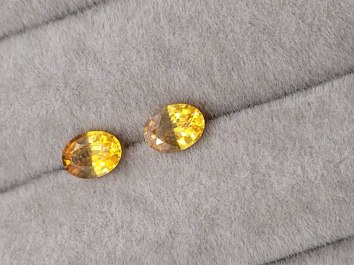
Windowing. A pale, washed-out patch through the centre where you can effectively see straight through the stone — light enters the top and leaves out of the bottom instead of bouncing back to your eye. If a see-through area opens up as you tilt, the pavilion is too shallow. The cutter kept weight in the girdle at the cost of the stone’s life.
Extinction. Dead black zones that never light up. Some extinction is normal and even useful — it is part of what gives a deep stone its drama. A lot of it means the stone is cut too deep, or is simply too dark in tone.
Face-up size: the number nobody quotes
Carat is weight, not size. Where the weight sits decides how large a stone looks on a hand, and two stones of equal weight can differ by a visible amount:
- Deep stones hide weight below the girdle. They weigh more than they look.
- Spread stones carry their weight across the face. They look larger — but go too far and you get a window.
- Elongated outlines (oval, elongated cushion, emerald) read larger than round or square ones of the same weight, because the eye reads length.
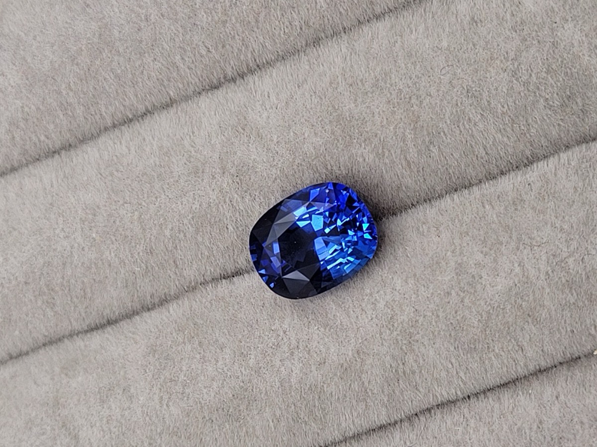
This is why asking for millimetre dimensions, not just carats, is the single most useful question when comparing two stones at the same price. Two 3 ct ovals can differ by more than a millimetre across the face, which is clearly visible once set.
Shapes, and what each is actually for
- Oval — the default for a reason. Elongates the finger, reads large for its weight, and sets easily in almost any mounting.
- Cushion — the traditional sapphire shape. Retains weight from the rough and presents a broad, soft-cornered face. Corners are protected by the outline, which helps durability.
- Round — the most forgiving to set well and the easiest to match in pairs, which is why studs are usually round.
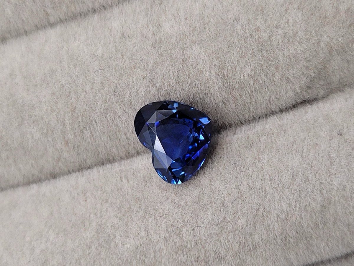
- Heart — the hardest to cut properly and the easiest to get wrong.
Facet style changes the character
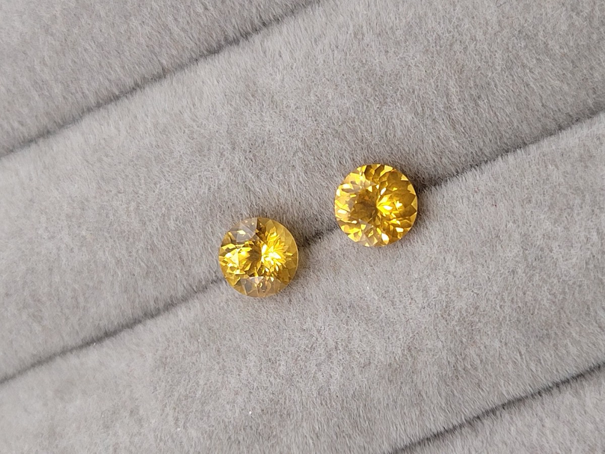
Beyond proportions, the facet pattern on the crown decides how a stone returns light. Fine, dense faceting produces many small bright flashes; broad, flat facets produce fewer and wider reflections. Neither is better — but they suit different colours, and it is worth knowing which you are looking at.
Polish, symmetry and the girdle
Three smaller things worth a glance before you commit:
- Polish — facet surfaces should be mirror-flat. Visible polish lines dull the stone.
- Symmetry — the outline should be even and the table centred. Asymmetry is hard to un-see once pointed out, and a jeweller will struggle to set it squarely.
- Girdle thickness — an extremely thin girdle chips during setting; an extremely thick one is hidden weight you paid for.
Questions worth asking
- What are the millimetre dimensions, face-up and in depth?
- Can you send a video of the stone tilting under ordinary light?
- Is there a window when it is tilted?
- Is the girdle thin anywhere I should tell my setter about?
Every stone here is photographed face-up and in the hand for exactly this reason, and we will film any of them tilting on request.
Keep reading
Why Ceylon
Two thousand years of sapphire from a single island, and what makes the material distinct.
Heated vs Unheated
What heat treatment actually is, why it is disclosed, and what the premium buys you.
How to Buy a Sapphire
Colour, cut, clarity and carat — in the order that actually matters for coloured stones.