Gemmology · 8 min
Reading colour
Everyone selling a coloured stone will tell you it has good colour. The word covers three separate properties, they are priced very differently, and once you can name them you can argue about price from the same footing as the dealer.
Diamonds are graded on the absence of colour against a fixed alphabet. Sapphire has no equivalent — no universal scale, no agreed vocabulary between houses, and no substitute for looking. What experienced buyers do instead is split colour into three parts and judge each one separately.
1. Hue — which colour it actually is
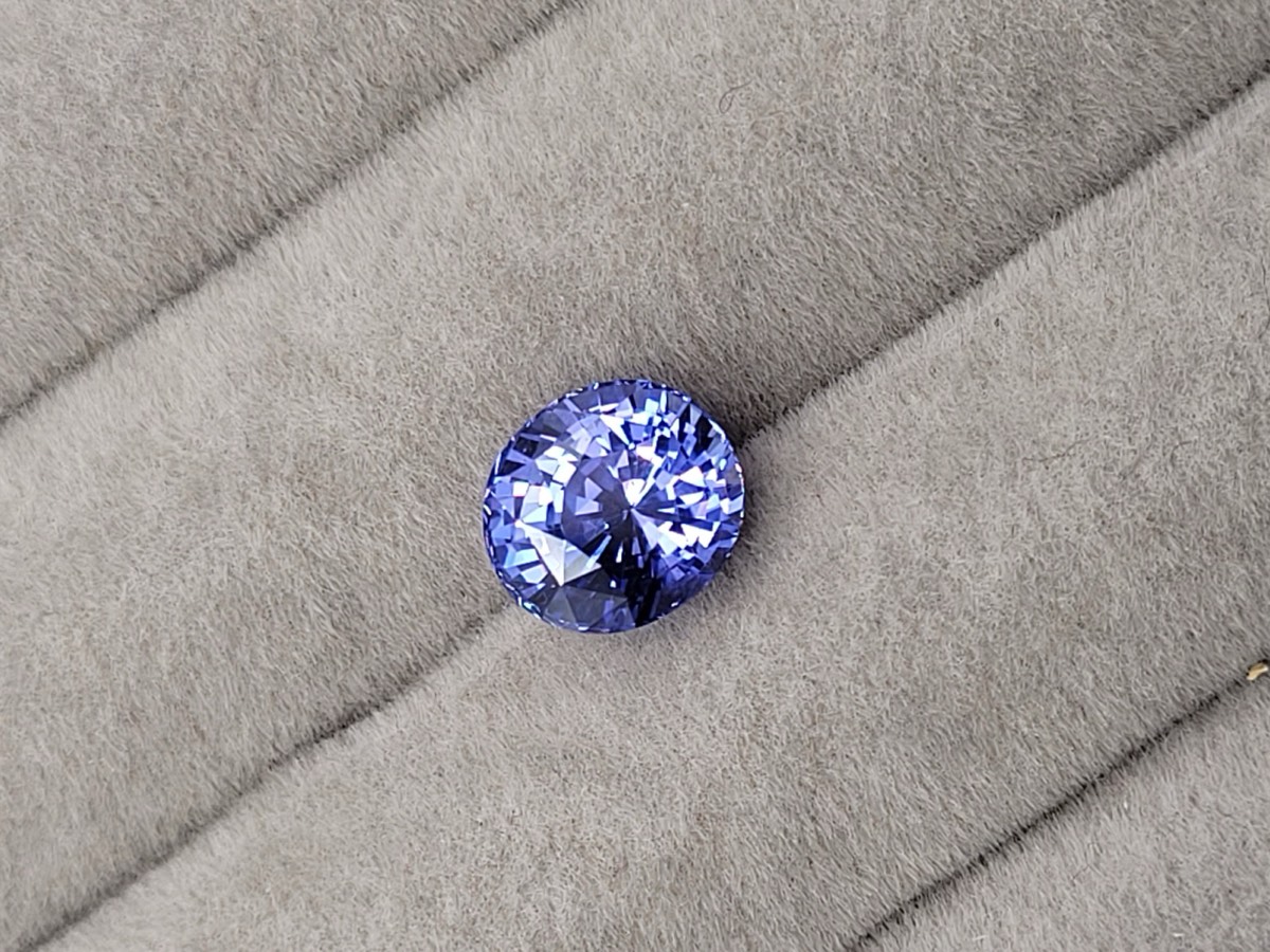
Hue is the colour itself, including any secondary hueleaning in from a neighbour. Ceylon blue is rarely pure blue; it usually carries a little violet. A pink may lean purple or orange. A yellow may lean green or orange.
Secondary hues are not faults. They are the stone’s character, and some are prized — the faint violet in cornflower Ceylon blue is part of what people are buying. What matters is that you can see it and decide whether you like it, rather than discovering it in daylight a month later.
2. Tone — how light or dark
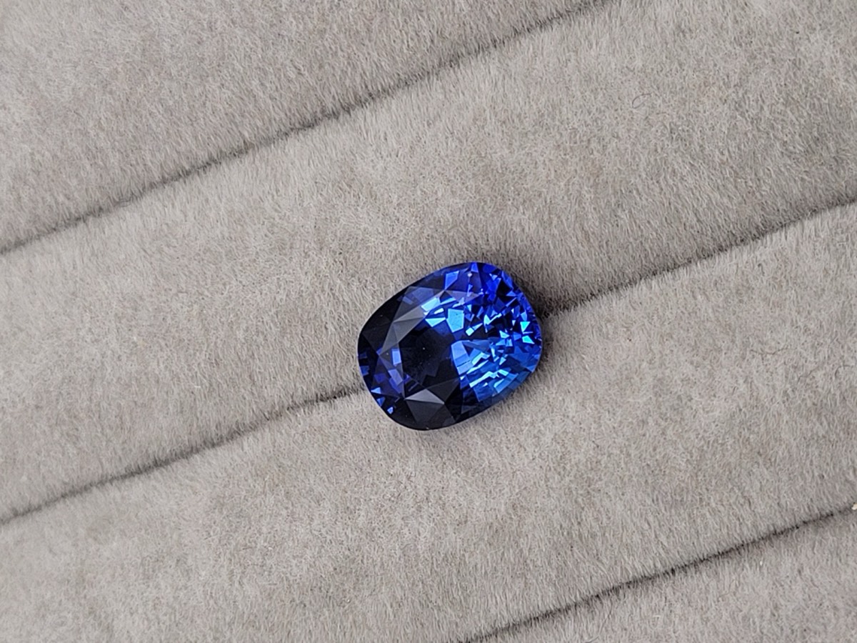
Tone runs from very light to very dark, and it is the easiest of the three to judge once you look for it. Both extremes cost you:
- Too dark and the stone reads as near-black in anything but direct sunlight. It will look wonderful in a jeweller’s spotlights and disappointing at dinner.
- Too light and the colour washes out, especially in a larger stone where you would expect presence.
The money sits in the middle — medium to medium-dark — because that is where a stone keeps its colour across the lighting a person actually lives in.
3. Saturation — how pure the colour is
Saturation is how intense and clean the colour is, as opposed to greyed or browned. This is what you are paying for. It outweighs hue and tone, and it outweighs weight more often than people expect.
The quiet colours are worth knowing too
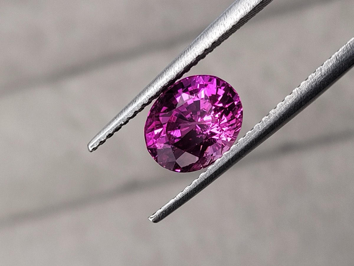
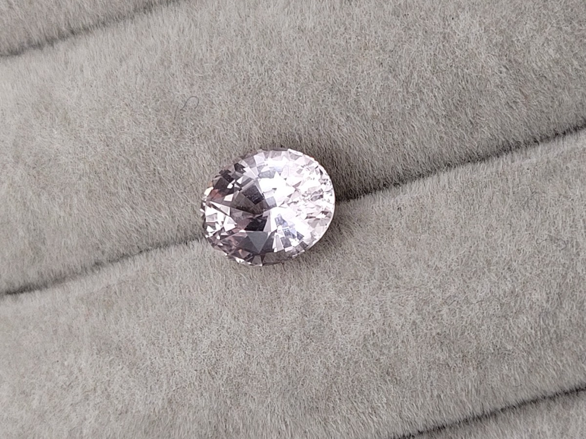
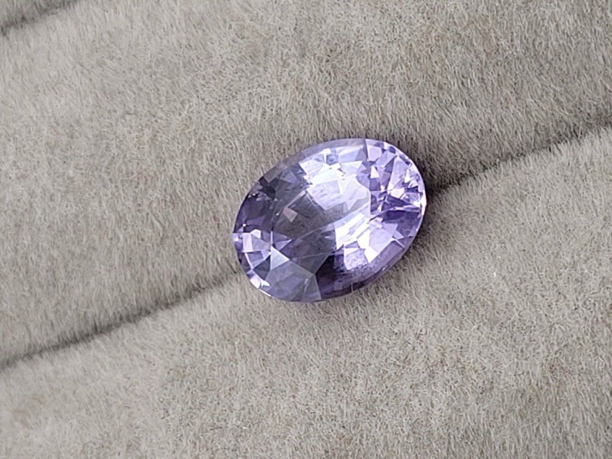
Strong saturation is not the only thing worth owning. Some of the most interesting sapphires are deliberately soft — and because the market prices saturation so heavily, soft colours are where the value often hides.
How to actually judge it
Four habits that will save you money:
- Look in two lights. Daylight near a window, then ordinary indoor light. Many sapphires shift noticeably, and you will wear the stone in both. Ask for video in both if you are buying remotely.
- Compare, never judge alone. Colour is almost impossible to assess in isolation and easy to assess side by side. Two photographs next to each other will tell you more than ten minutes staring at one.
- Tilt the stone. Colour should hold as it moves. A stone that pales dramatically off-axis is cut too shallow — see cut, windows and shape.
- Distrust a single photograph. Saturated stones in particular photograph inconsistently. A seller who sends several frames and a video in different light is telling you something about themselves.
Words sellers use, and what they mean
- Cornflower — a trade term for light-to-medium Ceylon blue with a violet lean. Descriptive, not a grade; nobody polices it.
- Royal blue — deeper, more saturated, medium-dark. Also a trade term, also unpoliced.
- Vivid — should mean top saturation. Often means the seller likes the stone.
- Padparadscha — the pink-orange variety, and the one term here with real laboratory meaning. If a stone is sold as padparadscha, ask for a report from a recognised laboratory; the premium is large enough to attract optimistic naming.
None of these are grades. They are a shared shorthand, which is exactly why your own eyes, in two lights, next to another stone, are worth more than any of them.
Keep reading
Why Ceylon
Two thousand years of sapphire from a single island, and what makes the material distinct.
Heated vs Unheated
What heat treatment actually is, why it is disclosed, and what the premium buys you.
How to Buy a Sapphire
Colour, cut, clarity and carat — in the order that actually matters for coloured stones.